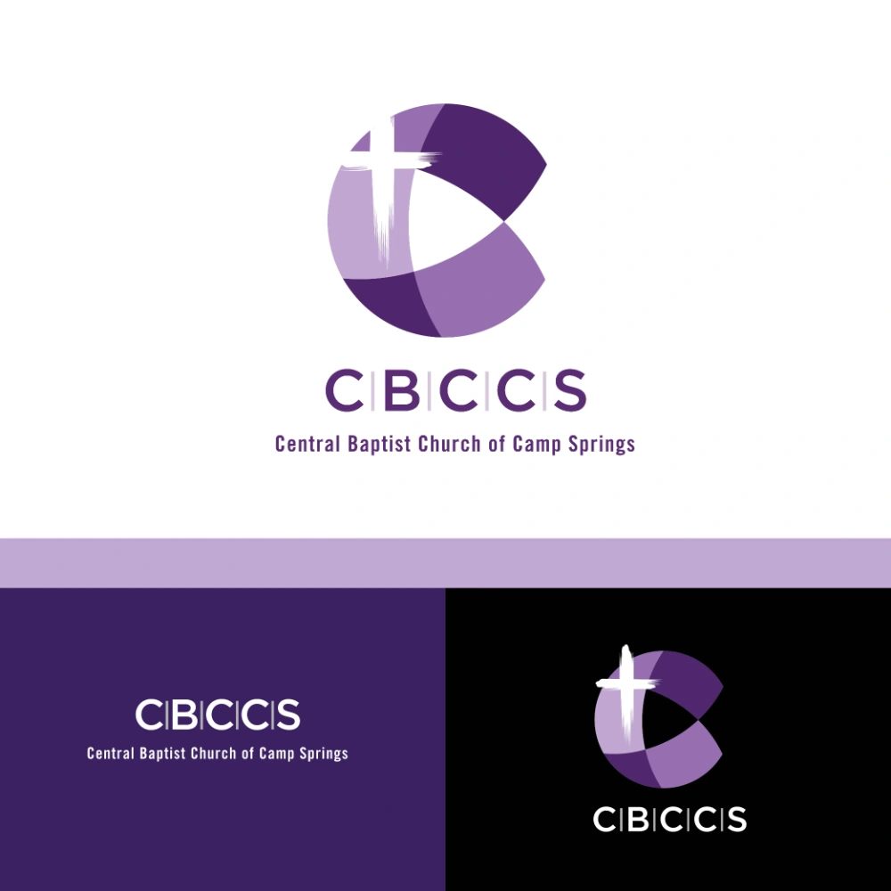
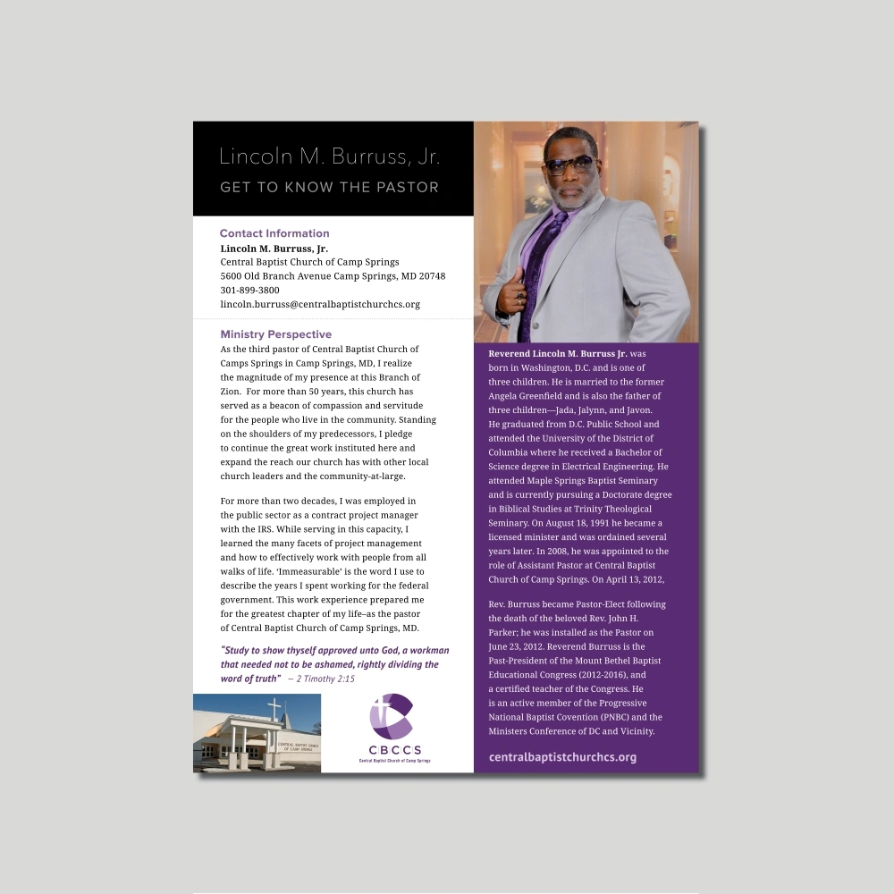
Prompted by their upcoming 10th anniversary Central Baptist Church of Camp Springs (CBCCS) wanted to create a fresh new logo that would pop and better reflect their church. One of the primary goals was to deliver a strong logo they could use to build stronger brand recognition and find a creative way to incorporate purple, a color they had come to know and love. They wanted a logo that was clear and not difficult to read as CBCCS is the acronym they had come to be known as. A fun stylized “C” mark was created and shows several tones of purple along with a strong wordmark.
Portfolio
◄ Back to all projects